Case studies / AI Services & Consulting / Survival Scripts
A whole business rebuilt in under 30 days.
Website redesign and business automation for a Dallas retailer
Survival Scripts sells physician-reviewed medical kits for disaster preparedness, travel and everyday emergencies. GREAT TECH rebuilt the platform behind the business, automated the operations around it, and redesigned the store in front of it — in one month, for roughly half what the conventional agency route costs.
Survival Scripts · direct-to-consumer medical kits · Technology Advisory, AI Services & Consulting, Managed Services · launched 2026
A sound business on unsuitable tooling
A licensed physician reviews every order. A licensed pharmacy fills and ships it. The commercial model worked. The systems around it did not scale.
The storefront was assembled in a drag-and-drop page builder. The catalog lived in a spreadsheet with no route to the website except manual re-entry. Twelve kits, each with dozens of medications, prices, add-ons and recommendation rules — and every change meant editing the same fact in five places. That is an operating cost, not a design problem.
The catalog could not be maintained
Price, medication list and thumbnail lived in separate places. Updating one meant hunting the rest. The site drifted from the pharmacy's own data.
The product could not explain itself
Kits listed drug names, doses and counts — correct, and written for a pharmacist. A customer choosing between a $179 kit and a $1,299 one needed it translated.
Undecided buyers had no path
Customers who did not know which kit they needed had no way to find out. In a considered purchase, that is the largest single point of drop-off.
Demand went unrecorded
Visitors arrived, browsed and left with nothing captured. Marketing had no list and no signal about what people came looking for.
How the engagement was structured
The division of labor was set at kickoff. Survival Scripts owned the clinical and pharmacy side — catalog data, medication logic, and the decision tables behind kit selection. GREAT TECH owned the platform, automation, design and production. Neither side waited on the other for approvals; work moved through scheduled joint review gates instead.
Both sides committed to a single source of truth for product data, so the pharmacy's records and the storefront could not diverge again, and to a fixed 30-day window. Anything that did not survive joint review did not ship. Anything outside the window became Managed Services work after launch rather than a delay before it.
Not a website project
The store was the visible layer. Underneath it we built the system that runs it; around it, the operations that feed it. The four interlock, which is why they were scoped together — scoped as four separate projects, each would have paid for the others' setup costs.
One principle then runs through the whole build: make the information easily consumable, with no distractions. The client's data was already complete and correct — it was simply written for a pharmacist. Almost every screen applies the same treatment. Drug codes became cards naming what each medicine treats. A spreadsheet of kit contents became a browsable reference with a coverage matrix. Twelve kits became three collections and a guided quiz. Nothing was invented; it was reorganized, with careful consideration for usability at every step.
A custom platform
One source of truth holds every kit, price, medication, add-on and recommendation rule. All 50 pages are generated from it — product pages, collection pages, quiz results, thumbnails. A fact changes once and is correct everywhere.
Automated operations
A guided quiz built from the client's clinical decision tables recommends a kit, captures the customer at peak intent, and delivers the lead to their marketing list. Add-on offers surface at checkout. Reviews cycle sitewide from one pool.
A redesigned store
Every page rebuilt — structure, layout, purchase flow, and every word of copy. The physician review moved ahead of the price. One clear action per screen, designed at phone width first. Checkout and the fulfillment integrations were optimized and brought into the same visual system, so the purchase path holds together from product page through to confirmation.
Content production
Studio photography of the kits and their contents, a rotating 360° view of every bag, and a full print catalog of the range. Produced in-house, inside the same window.
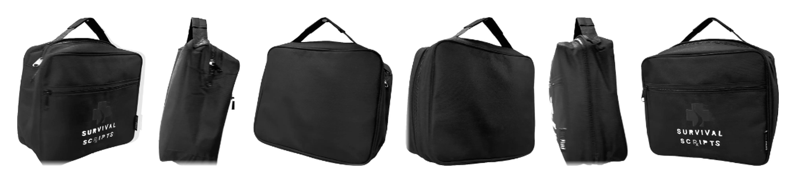
Every bag in the catalog was photographed from all angles and animated to rotate on the page. That production work is inside the 30 days.
Half the cost, a fraction of the time
A conventional agency scopes this as four engagements — platform build, automation project, site redesign, photography shoot — four teams, most of a year. We ran them concurrently, as one.
AI closed the gap. It did not replace judgment — every decision went through review with the client, and every clinical fact came from their data. It replaced the production weeks between a decision and a finished page. Because the site is generated rather than hand-assembled, the twelfth product page cost almost nothing once the first was right; the same applied to copy, photography treatment and the catalog, which is produced from the same data rather than laid out separately.
| Inside the 30-day window | Delivered |
|---|---|
| Site pages built, including 12 product pages and 3 collections | 50 |
| Kits with full studio photography and a rotating 360° view | 12 |
| Long-form articles written and published | 13 |
| Print catalog of the full range, generated from the same data | 1 |
What a customer sees now
Same company, same kits, same prices. What changed is how much the page can tell you.
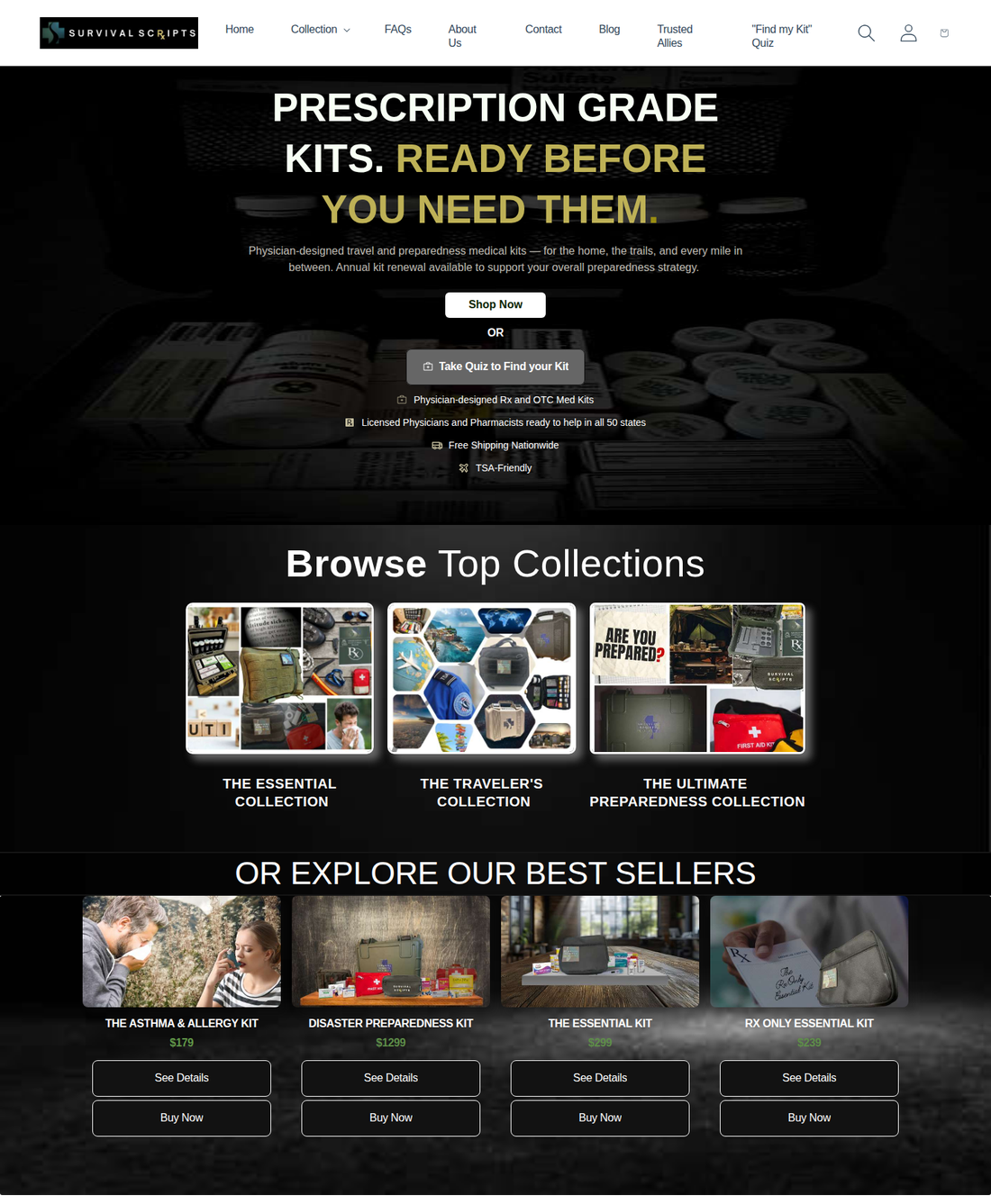
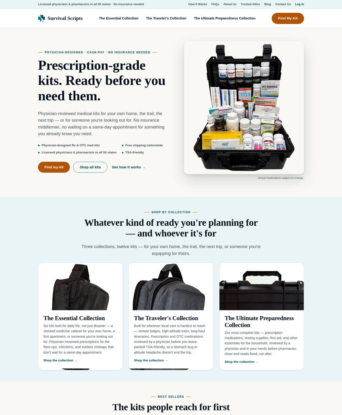
"Find my kit" opens the guided quiz for undecided buyers; "Shop all kits" serves those who already know. The previous page offered one button that scrolled back down the same screen. Each collection card now names itself, states who it is for, and closes with a clear action.
The page that closes the sale
This is where a customer commits $1,299. It has to answer every question before they think to ask it.
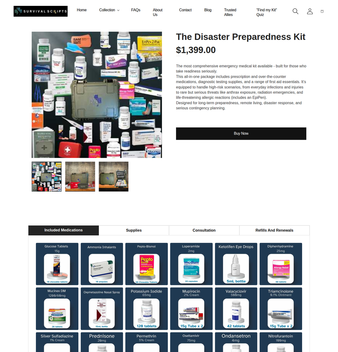
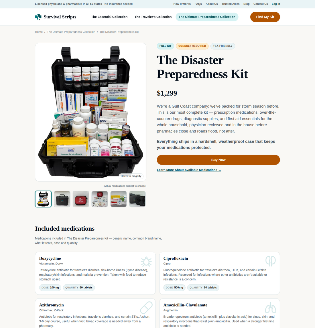
A kit list a customer can read
Each of the 31 medicines gets its own card: the brand name people recognise, and a plain description. "Nitrofurantoin 100mg" is also "Macrobid" and "antibiotic for urinary tract infections." The same treatment runs catalog-wide — all 38 medications cross-referenced in one place, with the kits each appears in and the dose in each.
The consult ahead of the price
A physician approves every order — a differentiator in this category. The previous layout placed it below the price. It now sits above the kit name on every product.
Post-purchase terms on the page
Delivery window, packaging and refill terms are stated in plain language at the point of sale, rather than arriving as a support email afterward.
Most of this audience buys on a phone. Every page was designed at that width first and verified at it before launch.
The part that keeps paying
A redesign is a one-time gain. The platform underneath changes what the team can do every week without engaging anyone.
Change a fact once
Update a price, a medication or a kit's contents in one place. Product page, collection card, quiz result, homepage thumbnail, the master medication reference and the printed catalog all follow. A day of careful editing becomes a single edit.
Launch a kit without a developer
A new SKU is an entry, not a project. Its page, cards, quiz routing and catalog listing are generated with everything else.
Capture demand automatically
The quiz recommends a kit and collects the customer's details in the same step — the highest-intent moment in the funnel. Leads reach the marketing list without rekeying.
Reprint the catalog on demand
Print collateral is produced from the same source as the website. When the range changes, the catalog is regenerated rather than redesigned.
Adjust the upsell centrally
Which add-ons are offered against which kit is configuration, not code. The offer at checkout can be retuned by the people who know the margins.
Stand up campaign pages
Dedicated landing pages for a campaign or a channel are generated from the same catalog, so a promotion does not require a separate build or a separate set of facts to keep current.
Before this engagement, a price change was a spreadsheet edit plus five manual site edits plus a catalog revision. Now it is one edit. The work did not move to a cheaper vendor; it stopped existing. That, rather than the launch itself, is where the return on a project like this accumulates.
Measured, not asserted
We measured the finished product page against the two best-known competitors in the category — same browser, same window size, same day.
| Product page, measured | Survival Scripts | Competitor A | Competitor B |
|---|---|---|---|
| Time to finish loading | 0.53s | 3.34s | 2.32s |
| Time to first byte | 79ms | 55ms | 1,754ms |
| Requests to load the page | 13 | 457 | 161 |
| Scripts on the page | 2 | 175 | 128 |
| Outside companies loaded | 2 | 53 | 30 |
| Page weight, uncompressed | 80 KB | 806 KB | 461 KB |
Competitors are two national direct-to-consumer medical kit retailers, one on Shopify and one on WordPress. Load time is the most reliable predictor of conversion in e-commerce, and this audience often buys ahead of a storm on a degraded connection.
19 of 45, to 39 of 45
We scored both versions across nine usability checks, five points each, judging what a customer can actually find out. The rebuild improved on all nine.
| Usability check | Before | After | What decided it |
|---|---|---|---|
| First impression | 2 | 4 | The new page states what the company does in the first screen. |
| Finding your way | 3 | 4 | The three collections moved up into the top bar. |
| Links that say where they go | 2 | 5 | Image-based links carried no text a browser could read. |
| Knowing what you are buying | 2 | 5 | Drug names alone, against 31 cards that explain each one. |
| Trust | 3 | 5 | The physician step, the pharmacy and every policy page are named up front. |
| Calls to action | 2 | 4 | One clear main action per screen. |
| On a phone | 2 | 4 | Everything stacks. Nothing runs off the screen. |
| Works for everyone | 1 | 4 | Structural headings and image descriptions, which a page builder does not generate. |
| Easy to read | 2 | 4 | Shorter lines, fewer capitals, plainer words. |
| Total | 19 | 39 | Improved on every check |
A platform, automated operations, a rebuilt store and a full content library — in under 30 days, at roughly half the cost of the conventional route.
What this engagement produced
Survival Scripts had all three of the answers a customer arrives looking for: what is in it, who checks it, and what happens after I pay. The tooling had no way to publish them, and no way to keep publishing them as the catalog grew. The store now answers all three at the point of decision, and the team can keep it that way without adding headcount or re-engaging a vendor.
That is the difference between a redesign and a transformation. One improves what a customer sees. The other changes what the business can do.
What would 30 days do for your business?
We build for companies that have to be trusted before they can sell — regulated products, considered purchases, long decisions. Advisory to plan it, AI Services to build it, Managed Services to run it. We start by measuring what you have against your competitors and showing you where the opportunity is.
Delivery window measured from kickoff to client approval of the live site. Cost comparison is GREAT TECH's own estimate against conventional agency engagements of equivalent scope; it is not a quoted price. Previous-storefront screenshots captured 6 September 2026 before replacement; new-site screenshots captured from survivalscripts.com 15 September 2026. Competitor timings measured 12 September 2026 using browser performance timing — same window size, same session. Usability scores are GREAT TECH's own assessment. Published with the client's approval.
Industry — Direct-to-consumer medical kits
Location — Gulf Coast
Scope — platform, automation, store, content
Delivered — under 30 days, 2026
Services used — Advisory, AI Services, Managed
Same problem?
If your site was assembled rather than designed, the first step is the same every time. We measure what you have now, against your competitors, and show you exactly what it is costing.
Get a Free Technology Assessment (817) 940-4008Ready for technology that just works?
Get your free, no-obligation assessment today.